If you want to create a really good design for your garden, it can be helpful to have a broader understanding of landscape design. I’ll walk you through my knowledge of Landscape Design Theory, developed during five years of study and further professional experience.
While it can mean different things to different people, for me, Landscape Design Theory refers to the following:
Landscape Design Theory is the theoretical and conceptual exploration of ideas within the landscape architecture and landscape design disciplines.
The most important concepts explored are the tension between Form and Function, and, in contrast to other design disciplines, the impact of Time.
Form is the appearance of something – an object, a space, a site. Function is the purpose of that thing – how people interact with and use it. Time refers to the way the dynamic nature of the outdoor environment shapes a landscape design.
Within these larger concepts are a number of landscape design principles and elements. Designers consider and apply these during the design process, and they include:
- Line
- Colour
- Texture
- Proportion
- Contrast
- Solid vs Void
- Unity
- Repetition & Rhythm
- Hierarchy
- Symmetry/Asymmetry
These principles and elements are spread across the main concepts within landscape design theory. We’ll explore the main concepts in more detail below and which principles/elements designers use as part of the landscape process.
Before we do, however, let’s take a quick look at the difference between Theory and Practice, and why it’s important to “ground” landscape design ideas and concepts in a time and place.
Landscape Design ‘Theory’ vs Landscape Design ‘Practice’
Theory
So how do landscape designers and architects explore ideas – push theoretical boundaries – if they’re not building residential or public projects?
Many designers will explore concepts and ideas through 3D modelling with specialised computer programs. These virtual projects can be entered into competitions, and shared through forums, publications and other discussions.
Sometimes these explorations aren’t linked to a site at all. The designer wants to push the boundaries of an abstract idea, so site is less important than stretching the idea.
This gives designers free rain to push certain concepts beyond what is considered practical and adds to the overall body of knowledge within the discipline, giving designers new ways to approach real world problems.
On other occasions the unbuilt project is part of an unsuccessful entry for a tender process. These designs are for a real location, but aren’t successful – the clients choose another option.
Despite that, designers sometimes recycle these ideas in other future projects, so the work does not go to waste. It is part of the landscape design ‘theory’ that informs that designers practice.
Practice
All this said, it is important for all landscape architects and designers to ‘test’ their concepts and theories in the real world. They need to be “grounded” in, quite literally, the ground. To be applied to a specific site to see how plausible and effective they may be.
To ground a project within a site the designer needs to understand the purpose or function of each space, and the site as a whole. This provides a touchpoint they can refer to during the design process, to ensure the space, while keeping to the desired form and aesthetic, is still functional and practical.
Let’s explore each of the landscape design theory core pillars and see how designers can use elements and principles to “ground” them to a specific time and place.
Exploring Form In Landscape Design Theory
As I said, form is the appearance of something. It’s physical properties. In landscape design theory, form can apply to a specific object or the whole aesthetic of a site – all the objects within it and the material and colour palette.
There are a few elements outlined above that apply particularly to form. I’ll touch on each here, but if you would like to learn more about these elements and other principles we explore, check out my article on landscape design principles.
1. ‘Line’ Helps To Define Or Blur Objects In The Garden
You can tell very quickly what style a garden is based on the lines within the landscape.
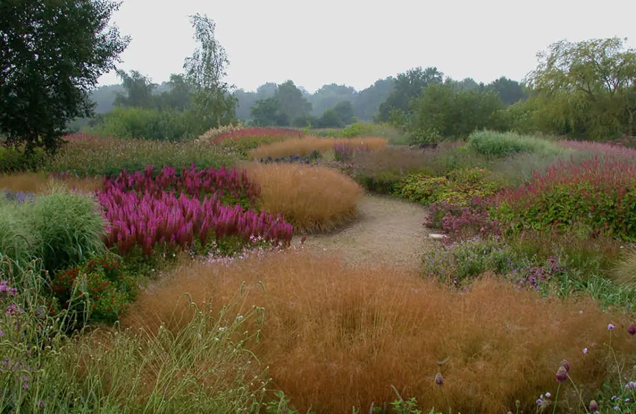
Modern and formal designs use straight, crisp lines to differentiate materials and colours. This then helps delineate spaces. Natural or informal designs prefer curved lines, creating a more relaxing, intriguing feel – allowing you to hide things from view.
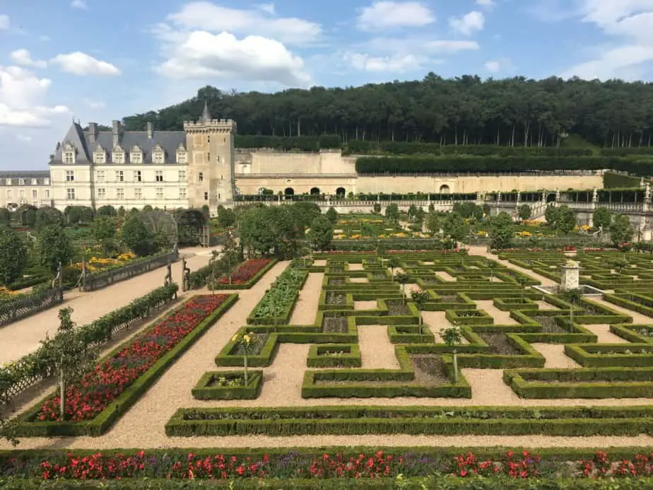
This difference can be observed at the broad design level all the way down to individual objects. Formal designs maintain sharp distinctions between objects and materials. Informal or natural spaces prefer to blur lines between objects, materials and spaces.
2. How ‘Colour’ In The Garden Brings Everything Together
Colour is an obvious element that falls under Form in landscape design theory. Like above, you can pick a garden style based on the number of colours you can spot in the garden.
Modern gardens lean towards a minimalist colour and material palette. Using less colours overall to maintain consistency, or highlight other forms of variation, like material finish or shape.
Cottage gardens tend to veer the opposite – opting for bold flashes of many colours at once. Green forms the background, and the designer aims for fields of colours, haphazardly (some would say ‘naturally’) dotted around the yard.
Your colour choice can help you change the perception of a space. Cool colours – blues, browns, blacks and some greens – recede in the landscape and can make a space feel larger. Warm colours – reds, oranges, yellows and pinks – advance, making areas feel smaller.
The last thing to note with colour is that, like the natural world, it can change across the seasons and years. Obviously this happens with certain plants, but it will also happen to materials – they will weather and form a patina as they respond to the local environment.
3. Using ‘Texture’ In The Garden For Looks & Practicality
Texture again refers to the physical aspects of the garden – both individual objects and the effect those objects create at a distance.
This idea of textural effect is something most beginners don’t think about. Plants and materials range from finely textured through to coarse.
Similar to colours, elements with fine textures recede into the background, while coarse textures advance in a space. And like colour, you can make plant and material choices to suit the needs of the spaces you are designing.

Finally, a good thing to note is the functional aspect textures can provide. Roughly textured materials – like coarse paving stones – are good to place in wet or potentially slippery areas.
On the contrary, sharp or spiky objects need to be placed with care – so young or tender hands and feet don’t accidentally stumble into them.
4. Understanding The Three Aspects Of ‘Proportion’ In The Garden
Proportion is all about how a component or space is larger or smaller, or appears larger or smaller, than it’s surroundings. It actually covers a few different physical aspects.
The dimensions of a component or space – length, width & height. A component or spaces size relative to things around it. And a component or spaces size compared to the user – namely, is it suitable for humans, or “human scaled”?
A simple trick to help with the first – the dimensions of a component – are to start with the rule of thirds. Take your longest measurement and make the others either 1/3 or 2/3s that size. So if your vegetable patch is 8′ long, make the width 5’3″ (2/3s 8′).
This also works well for heights – so if you want to plant a group of different trees that maintain proportion, choose one and work off that to select other trees that fit the 1/3 or 2/3 proportion rules.
For the second aspect, good designers find ways to emphasise or minimise things they want to highlight or hide using proportion. A feature plant will ‘pop’ a lot more if it’s surrounding plants appear smaller, fading into the background behind it. Likewise, larger plants or trees around something you want to hide like bins or a utility.
Finally making something human scaled is all about recognising how we interact with spaces and components and ensuring what you design is suitable.
Steps are a great example. You don’t think about it, but narrow, short and high steps are much harder to walk up or down than more broad, deeper and smaller steps. The latter feel more comfortable, designed more for human use.
The easiest way to ensure things are human scaled is to start with existing standard items around you. Not sure how tall a bench seat should be? Measure your chair or couch to get a starting point. Same for paths – measure a corridor or doorway, understand how you will use the path, and widen or narrow as needed.
5. Using ‘Contrast’ To Bring A Garden To Life
You can contrast many things within a garden. Look at any of the principles outlined above and you can find opposites within them. Light vs Dark. Straight vs Curved. Coarse vs Soft. Large vs Small.
Like many things in design, contrast can be as extreme or subtle as you like. You can opt for complete opposites in colour across your design. Or juxtapose a small area or space with a large feature tree, sculpture or other object.

In terms of trying to use contrast, as a beginner your best approach is to keep things simple and try to copy examples you find elsewhere. That doesn’t mean you copy their exact design, but you use the same or similar contrasting elements they have.
Another neat, slightly more advanced tip with contrast is to apply it to finishes within the same material. Take stone. If it is relatively smooth in your design, see if you can add in a paver – or strip, or whole different section – of coarse, rough stone.
This is a great, subtle way to introduce contrast and create some interest in an otherwise bland or utilitarian space – such as an open paved area.
If, as you explore ideas, you feel your design or a space isn’t really working, see if you can add a contrasting element within or throughout it. Choose something you are already using or featuring – a shape, colour, finish or scale of objects – and see if you can sneak in something to contrast against that element.
Part of the fun is seeing the potentially crazy things you can come up with, that may, in the end, make it into your design – something you might never have planned at the start.
6. ‘Solid vs Void’ – How Landscape Designers Carve Up Space
This is a principle many people aren’t familiar with – or, at least, the language around it. At it’s simplest, it is about how a viewer perceives different parts of a space or garden – what impacts them the most and what impacts them the least.
It’s sometimes referred to as “Weight” or “Fill” or “Mass” or “Figure/Ground” or “Positive/Negative”. Different design disciplines call it different things within their own medium, but it’s essentially the yin and yang of the physical objects vs the space itself.
Professional designers know the void is more important, on many occasions, than the solid or fill. In architecture and landscape architecture, users generally occupy the void – so designing it to be an effective space, for whatever the user needs, is paramount.

Here is a very basic sketch I used in my Landscape Design Principles post that illustrates the perception or effect physical object can make in a space. It’s simple, but you can quickly “feel” the impact different objects have within a space – their presence.

This kind of sketching can help your design exploration because it gives you a very simply and quick way to judge what a space feels like when plants and trees reach maturity. Blocking out the space physical things occupy paints a picture.
You can even extrapolate shadows onto the ground and surrounding spaces if you want, to give you a better understanding of how these components interact with sunlight and other elements.
This is an approach many professionals take when designing buildings, gardens and even graphic or web design. They “block out” space, get a sense and feel for where they want to place certain objects within their medium.
It can be a useful approach at any stage in the design process. From right at the start to help you determine open or filled spaces through to testing your latest layout to see how different components fit together or impact their surroundings.
The key to drawing in this style is to draw quickly. It’s not meant to be a final product – merely a tool to help you explore an idea, and tweak it if needed.
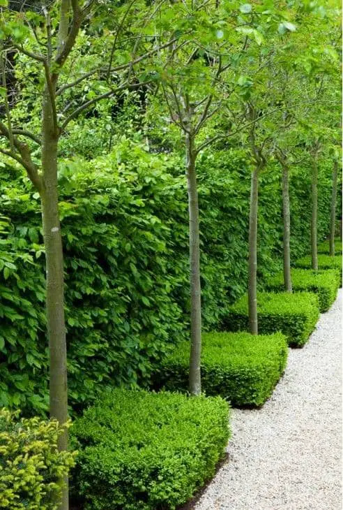
7. How ‘Repetition’ Builds Rhythm In The Garden
Repetition & Rhythm are some common principles that, for once, don’t fall within the ‘form’ part of landscape design theory. While they rely on some of the elements we’ve touched on above, they are more about the pacing and feel of a design as you move through it.
The aim with using Repetition and Rhythm in your design is to build a sense of familiarity for the occupant. Seeing or passing by something you’ve seen before helps ground you in a space, making you more at ease.
Repetition is when you repeat certain elements within a design. It can be certain colours, materials, a pattern, motif or perhaps specific plants or components. The important thing to note here is the thing you repeat doesn’t have to be exactly the same.
You might have plants of a similar shape or colour, but varying sizes. Or you have an expanding or contracting series of spaces you move through along a path. Or perhaps a pattern in the garden bed or ground – something that grows larger as it spirals out.
These are all somewhat repetitive elements – things that ‘echo’ something the user has seen before – but may be tweaked or adjusted to suit the new position or space they occupy.
Rhythm is more about the flow as you move through a garden or yard. If you move from one ‘room’ or space in a design to another, you don’t want to suddenly come across something jarring or out of place (unless it’s by design).
As the user, you want to feel as though you intuitively ‘know’ what you’re about to see. This is enhanced by repeating components or elements in your design that you have already seen or passed by. In some ways, rhythm is the goal, while repetition of elements is one way to achieve that goal.
8. Achieve ‘Unity’ In Your Garden Through Simplicity
In some ways the opposite of contrast, unity is about how all the different principles and elements in your design mesh or hold together.
If you successfully manage the things above, you are likely to come up with something that feels unified – something deliberate and intentional – rather than a random collection of isolated items.
The easiest way to create a design that feels “together” is to limit your options from the start.
This sounds weird, but in reality constraints – things you aren’t able or allowed to do – help you make design decisions much more easily. An open slate means you have nothing to “work against” or react to.
A good place to start is to pick an aesthetic or garden style you want to emulate and find examples of it. Pull out a few key colours, materials and textures you like and apply them to existing layouts you have or start a new set of design sketches with them in mind.

If you have a design or layout you like, but it doesn’t quite feel like it works together, try making one component in each space the same – a plant or material choice, or colour or finish. This can help tie different spaces together across a design.
If things feel to busy or still don’t work, try removing stuff. Sometimes you need to reduce clutter to focus on the things that matter. Look at a specific room or space. Draw a sketch or section of it. Then, one at a time, remove things from it and see if it still meets your criteria.
Unity is often easiest to achieve when you have a simple array of options that you’ve placed across your design. So start with that approach and see where it takes you.
9. ‘Hierarchy’ In A Garden Is More Than A Focal Point
Hierarchy is all about the sequence of how you perceive a space, or series of spaces, in a design. What is the first thing someone sees as they enter or view a space?
This ties into the idea of a focal point or feature in a space. These are components placed in a specific spot, designed to draw the eye.
And beyond the focal point itself, hierarchy deals with the layers behind it. What your eye or other senses are attracted to next, then after that and so on – right to the background.
So how do you use or think about the hierarchy of a space?
For beginners, it’s easiest to start with your focal point, or main components within a space. Mark out on your design the main spots you are likely to view this space from.
Think about what you want to bring forward in the space, and what you want to fade into the background. Or what you want to be easily visible, versus what you want to hide away, forcing people to explore a space more.
A great way to develop hierarchy is to choose a few of the principles we looked at above and take contrasting elements within them. As we noted, light colours advance, while darker colours recede. Coarse or rough textures pop, while softer textures blend. Sharp lines and shapes often stand out from a fine or blurry background.
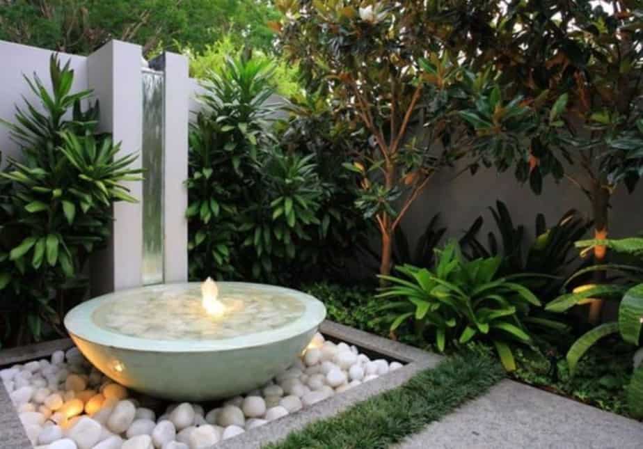
The example image above shows this concept very clearly even in a small space. The water feature – in open space, with light colours and a unique shape – stands out. The tall column behind it stands out from the background due to it’s sharp lines and light colours. The white stones at the base of the water feature help that whole area advance in the space. The plantings have a strong shape, with lighter leaf tops popping from the background. Finally lighting brings some features forward while others recede into the shadows.
Try creating layers within a space by mixing and matching combinations of these principles across different materials. And speaking of materials, they too can have an impact on your perception of a space.
We’ve focused mainly on sight when discussing hierarchy, but it’s about more than what we see. We perceive spaces around us with all of our senses – sound, touch, taste and smell. Professional landscape designers find ways to engage these senses as part of the hierarchy of a space.
Maybe, on entering a space, particular scents from flowers or plants greet you first. Or the sound of trickling water from a water feature is what draws you into an area. Or maybe even the ground you walk on invites you to come in, or prevents you from coming any closer.
These are simple tricks, but incorporating them into rooms in your garden adds layers that are more than just visual.
10. Using ‘Symmetry & Asymmetry’ In Your Garden Design
Simple to understand; difficult to implement.
Symmetry is when a space is the same on one side as the other. It is mirrored in some way. It could be as you look down it, the same components line each side, or the pattern or layout of spaces is the same.
Symmetry works well in formal or modern gardens. Where repetition and predictability are the main goal. It often leads to clean, simple layouts with a minimal colour and material palette.
Asymmetry is the opposite. It’s often about shifting components so they don’t match their opposite. Instead, things sit in groupings or clumps, or perhaps one side of the view is much “heavier” than the other.
The best way to design either option is to draw a line down the centre of your space – or even your whole design. For a symmetrical design, you want the different elements in your design to sit at the same position on either side – the same distance from this “spine”, and the same distance from the surrounding components.

This doesn’t have to be physical elements. You can aim for a symmetrical design with spaces as well. Looking from a key vantage point down your yard, you may opt for a kind of flow of spaces – expanding and contracting down the length of the yard.
And within these spaces you can adopt for more symmetry with the placing of items and material and colour choices.
This spine down the centre of a space is also useful for creating an asymmetrical space. In this case you don’t want to mirror components or spaces opposite each other.
Asymmetry is about an imbalance between them. One may be small, the other large. Or one space is open and flat, while the opposite side contains a large cluster of plants, trees or other items.
Like some of the principles above, the best way to explore where things should be positioned is to know the mature sizes of things – especially trees – and to draw some simple, rough sketches, changing the positions of components slightly to see what looks best to your eye.
Moving around this “weight” can help you determine where it will fit best, and where else you should place other, complementary pieces to offset it.
One thing to note when it comes to creating a symmetrical design. Because you are limiting your materials, colours and layout options, everything you position and include needs to be exact. Humans notice patterns in our environment, and one thing more noticeable than a clean pattern is when one little element is slightly out of place.
So although symmetrical spaces can be really beautiful to be in, you have to ensure things are the same position, size, shape and colour to truly make it work. And this can take some time to maintain.
Asymmetry, on the other hand, can give you more leeway. Depending on your design style, you may still need to keep things clean, tidy and sharp. But, you are less likely to be ‘punished’ for having an item slightly out of place.
Nature is generally asymmetrical – things aren’t planned out in exact positions – so asymmetrical designs work well with more natural styles, materials and colours palettes.
Function In Landscape Design
We’ve touched on a number of principles and elements above, many of which relate to the form or appearance of an object, space or layout. Let’s have a quick look at how to think about the function of a space, and how it can guide your decision making.
In many of my guides – my 6 Step Beginner Guide and my 101 Landscaping Guide, not to mention my ebook The Garden Design Process – I talk about the importance of developing criteria for a space.
Criteria are the little things you want the space to include.
It can be a material or colour choice. Or perhaps how you specifically want to use the space – how many people it’s for, what you want to do in it. It can also touch on when you want to use a space – what time of day, season or year.
Having a short list of criteria for each space you design – and things you layer across your designs – helps you track whether or not a space functions for you. Does it allow you to do what you want to do in it?
For a garden, the act of thinking about how you want to use the space can help you develop these benchmarks.
If you use a wheelchair or walker, you want to ensure any garden beds you design – especially if they’re raised – meet your needs. If the path is too narrow, or the beds too low, then you can’t use the space as you’d like. It doesn’t function for you.
So despite the abstract nature and discourse around form and function in many design fields, for the beginner designer, the best way to think about incorporating function is to actually think about how you want to use a space.
Once you have that in place (and you can tweak it as you go) you are halfway to making sure your form looks good, and functions too.
The Unique Part Of Landscape Design Theory
Many design disciplines touch on the idea of time. How you need to think about a space or object changing over time, adapting to the changing needs of it’s users.
None really deal with time, at a core level, like Landscape Design.
Being outdoors, you’re more exposed to the weather, it’s extremes, and the random events that can occur. Not only that, but many of the main materials in the garden – plants, stone, wood, etc. – grow and change over time.
The change in plants obviously has a huge impact not just on the final space, but on how you approach designing in the first place. Architects don’t design a house or room where they think about a wall growing 10 times it’s size. Landscape designer’s do.
This recognition that growth and change is a fundamental part of the design itself provides a bit of variance to the outcome. You can measure and plan and prepare as much as you like, but you know, deep down, things will still not go as you expect.
Some plants will struggle, others will thrive. Materials will wear in strange spots. As they say, change is the only constant.
So what does that mean when it comes to exploring ideas and creating a design? When dealing with plants, try to design around a range of dimensions – height, width and length – rather than to an exact size. If you do want something to fit a very particular size, you need to ensure you can guide and maintain the plant or tree to fit within that box.
Another consideration is to try and determine where your most exposed and protected areas are. If you’re worried about materials wearing away or the mismatch between similar areas over time, talk to an expert to get advice on hard wearing materials.
Or, maybe you plant around this likely discrepancy – choosing materials that will wear in interesting ways, highlighting the patina that evolves as a feature.
One last tip, if your garden style permits it, is to build in flexibility over time. By all means create a space for young children to play. But leave infrastructure in place to turn it into a different kind of area once they grow older. A play area becomes a vegetable patch. Or a sandpit becomes extra decking.
Perhaps the most important insight is to view time as a friend, not an enemy. Your plants and trees will grow, and if you’ve considered some of the elements and principles we looked at above and planned around this, you’ll find they grow into your garden design, rather than on top of it.
And that is it for our look at landscape design theory – and a few landscape principles and elements thrown in for good measure. For more in depth commentary on those, check out this post.
Let me know your thoughts in the comments below as well, on how you would like to explore and use some of the theories and ideas above in your own garden designs.