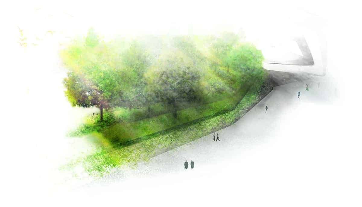
This is Part 4 in a series on Using Images as Inspiration for generating your own Garden Design Ideas.Today I look at the most overlooked aspect of on line image 'tweaking' - how the image is framed and manipulated to show the garden at its best.
Anyone familiar with social media sites such as Instagram, Pinterest or Facebook (or if you have teenage children) will be aware those simple little images often take hours to set up and create.
Just like teenagers, most landscape designers edit their photos to get the most ‘clicks‘. Understand what you see is often very contrived and curated to draw your attention to that particular image. We are visual creatures – competing in a visual marketplace requires extra steps to stand out.
HOW THE IMAGE IS CURATED AND FRAMED
This is basically how the photo is shot, and if the image is cropped or altered in any way. It can be manual techniques, such as positioning the camera to hide unsightly aspects from view. Or the digital realm of Photoshop. It’s easy to remove or subtly alter things that aren’t pleasant to show, once you know how.
People recognise the impact Photoshop has in retail marketing. It also has an impact on landscapes and gardens. Not to mention it’s commonly used in the Real Estate industry. Looking below, which image is more appealing?

MAINTENANCE AND PREPARATION OF THE GARDEN FOR THE IMAGE
Essentially talking about the cleaning and tidying that goes on before a photo is taken. Think raking, cutting, trimming, tidying and shooing unwanted people or animals away. Another aspect to consider is the careful inclusion of small, seemingly incidental details. Often they’re designed to evoke some sort of utopian or idealised setting. The target audience subconsciously gravitates to the scene, becoming more receptive to the message it’s sending. Although this image is not of a garden, have a look at how artfully it has been staged to evoke a cool, stylish ‘hipster’ work setting.

Despite it’s apathetic and casual appearance, it is incredibly finely detailed and staged. Each item in the image is carefully arranged – often multiple times to get it just right. Consider how much time and effort went into staging and assembling the image you have in front of you. Remember what you are seeing there is the very best view of that particular landscape.
TECHNIQUES USED TO INCREASE THE APPEAL OF THE IMAGE
Thinking beyond photoshop and cropping photos, what other ways has the photo been ‘artistically’ enhanced?
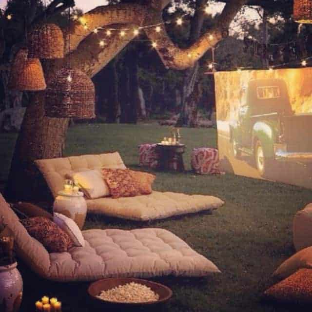
Dusk scenes are extremely popular in real estate. They soften edges, hide uglier details, and provide a feeling of intimacy and warmth. After a tired days work, you’re invited into the warm and cosy home (or setting). Like all marketing, they target your emotions – ignoring the rational. They can work just as effectively for gardens (especially with expensive lighting).
Light and shadow is more dynamic and ‘alive’ than a bland grey background. Keep that in mind when trying to approximate that night time garden setting.

AIM OF MANY IMAGES IS TO GENERATE TRAFFIC
Finally a major point people consciously understand but subconsciously ignore is that images are CLICKBAIT. To get money from advertisers, they get you to click, view and hopefully continue browsing. They’re designed to do that. There is nothing wrong with this idea – it’s the aim of all marketing really. Remember this when looking through hundreds of photos and stumbling across a few that resonate with you.
They know they are competing against a large field of competitors. In order to catch your attention, they have to provide something pretty eye catching to make you stop. Often they bend the truth slightly to get that foot in the door. As I’ve shown, there are a huge number of ways to make any situation look better than reality.
Keep in mind that very little of what you see is what you get. Knowing this, you will have a much better eye for what IS real. And you can appreciate the more staged options for what they are – a performance and a show.

TOO GOOD TO BE TRUE
So as you can see there are a number of ways to improve an image, making it more eye-catching than it may be in reality.
The intent of this series is not to turn you off images – they are a great resource to use. It’s to make you more aware of what is missing. Keep these 4 Keys in mind next time you are scrolling through page after page of inspirational ideas, tips and tricks. With this in mind, you can look at images in a more useful and constructive way.
Once you understand what you are looking at, you can better see how to use it in your specific situation.
Take Action: TAKE A PHOTO OF YOUR BACKYARD
PRETEND YOU ARE SELLING YOUR HOUSE
FIND THE BEST ANGLE AND TAKE A PHOTO
LOOK AT HOW YOU WOULD CLEAN UP THE PHOTO
USING SOME OF THE METHODS OUTLINED ABOVE
Don’t worry about actually altering the image.
Just recognise the kind of staging that goes on, and understand how the image doesn’t always reflect the space truthfully.
I’ll be touching on how to unpack ideas from images, and how to apply them to your garden or backyard, in other series.


Whoop! I just got the guide in the mail and my gawd, but it’s AMAZING!!! Gotta run – I’m super inspired!