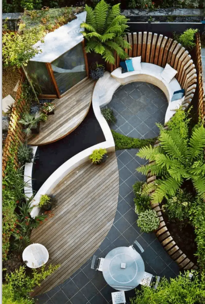
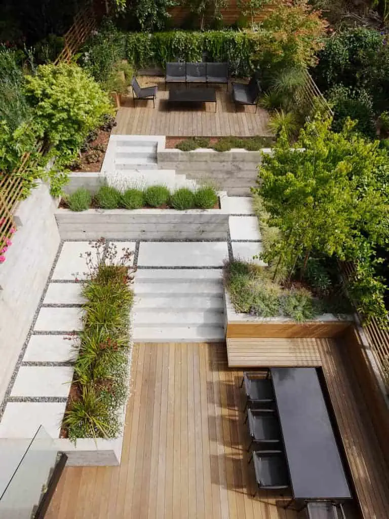
I’ve mentioned a few times some designs appear to be ‘arbitrary’. That is, the features in the design – pathways, garden beds, entertaining areas etc. – don’t appear to be influenced by anything. They were most likely just drawn onto a plan. This kind of ‘design’ work I call ‘Painting’.

In the image above, we have a small space with an interesting layout. BUT… I’m not sure what influenced the layout of these spaces and materials.
Is it just a set of lines drawn onto a plan? Different overlapping shapes? While (presumably) relatively effective as a space, I’m unsure where it is… it could be any number of places.
To me, great design is influenced by its surroundings, and I’m not sure how this one is.
Form X Function
To me, real design is form x function BUT it also takes cues and is influenced by its surroundings.
When I ask why a decision was made, this is the crux of the question. Did you arbitrarily draw this line here? Or was there a specific reason that it is this wide/straight/long etc.?
I’ve driven home the notion that you need to justify your decisions. It helps starting broadly and eliminating options. I still maintain that is the best option for your design work. But, ‘painting’ may be the most suitable option in some circumstances. I’ll touch on those later on.
Let’s look at the differences between painting and designing.
Painting
As I said, painting is often just drawing shapes on plan. The aim is to look pretty. Aesthetically pleasing.
Designing
Is influenced and shaped by the needs of the space. You’re testing against a function.
Different styles prioritise these approaches differently. Think about architecture. Modernism is all about function. Clean, straight lines. Little additional material or ornamentation.
Gothic, on the other hand, is about appearance. It uses excess material. Ornamentation or decoration signals a certain level of status. You can afford to live with ‘superfluous’ things or additional things to clean and care for.


Throughout history in many cultures, more of something – a material, resources, servants, cows etc. – signifies status. A house with large windows in England indicated extreme wealth (as windows were taxed, limiting their spread and size).
Ironically, nowadays the reverse is probably happening (at least in parts of the West). Returning to a more simplistic lifestyle signals a higher level of income and potentially status. Minimalism and clean living is a greater signal of wealth than consumption (in some circles).
That’s why organic, unprocessed and artisanal products are more expensive than mass produced. It’s not just about the cost of production – it’s also a marketing component. Buying these things signal a level of income and corresponding lifestyle and values.
But we’re getting off track. Back to painting vs design… The key difference is designing ‘tests’ itself against a function.
You could ‘paint’ an area. It may still be suitable for a function. But you haven’t used the requirements of the function, or site or weather conditions, to influence the design of the space.

When To Paint vs When To Design
So Painting really starts with a pretty outline and fills things into it.
It can be tiring designing every position in a site.
Going through multiple iterations of different programs in one position. Then another position. Then try a different program in those positions. And then combining them together in a plan. Then switching things around. Taking it to extremes. Reigning it back in with constraints… You get the idea.
I think for many people, going through this initial process will be helpful. You should focus your attention on the main activities and features you’d like to see in your site.
I said sometimes painting is the better choice when working through a design. Let’s look at some occasions where this may be the case.
For positions in your site that may be marginal. Think boundary areas, or certain spots that are small, cramped, shaded or otherwise difficult to work with.
You can (and at least initially should) test them with different programs. You do have a choice in how much effort you go to.
Sometimes it may be the program. A simple garden bed or feature. You want an aesthetic space you won’t ‘use’, rather than go to a lot of effort designing it. You can turn to an expert later for help.
In some ways this isn’t really ‘painting’ the way I’ve described it earlier. Chances are these spaces will be impacted by others around them. These more important spaces will be ‘designed’. You will work through the process with them. They then bleed into and inform this more marginal space.
When To Use ‘Painting’ In Your Designs
My point here is that yes, design is the more rigorous way to create. But that doesn’t mean painting isn’t appropriate on some occasions.
Use your judgement. Paint in areas with low utility. Or paint in areas with little allocated funds. Paint in places you can’t be bothered (right now) thinking about in depth.
I maintain you should attempt to design what you can. And while it sounds like I disparage painting in your design, I think it can be fine in some cases.
Never start your design from a ‘painted’ approach.
No main lines should start with an arbitrary flourish of the pen. Random curves, lines, colours etc. You can use space and “fat” or excess to accommodate these kinds of things. But that is only once you know where your minimum and maximum boundaries are.
Try to use the design process at the macro level. Feel free to paint at the micro level.

