
In my experience, good landscape design is underpinned by a number of landscape design principles. In today’s post I want to explore 10 of the most important elements and principles landscape designers use to “ground” their ideas within the site they are working in.
It’s easier to think of ideas ‘in the abstract’ – that is, floating in the ether, not connected to anything – I talk more about Theory in this post. Introducing reality makes it difficult to make these ideas ‘work’ because you are adding constraints that prevent you doing what you want, or planned, to do.
This is where landscape design principles come in.
Landscape design principles help designers apply theoretical ideas or concepts to a real world scenario. Through the landscape design process, the designer explores different ideas, or different versions of a similar idea, to see what works best in this situation.
Part of this testing or iteration involves changing aspects of the design – layouts, dimensions of spaces and objects, and materials. These aspects are formed by a combination of landscape design principles, such as:
While simple, these principles – sometimes referred to as elements – are what the landscape designer utilises first to help sketch, explore and test their designs. Every landscape or garden ever designed was developed using some combination of these principles.
Let’s look at each one in more detail, and how that landscape design principle informs garden design.
1. How Line In Your Garden Defines Your Style
Line is a core element within landscape design. It falls under ‘Form’ in landscape design theory – things concerned predominantly with the look and aesthetic of an object or space.
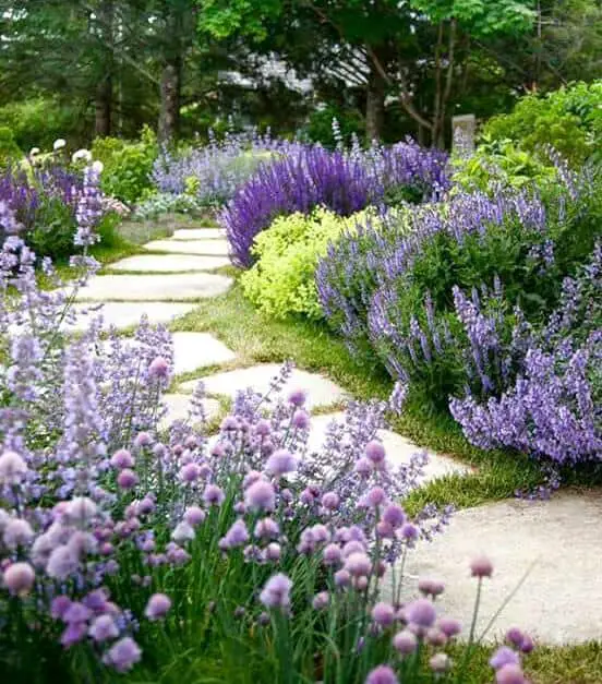
The type of lines used in a design also strongly hint at the garden style. Straight, bold lines suggest something formal and/or modern. Curved lines hint at something more ‘natural’ or informal.
Line impacts design not just at the macro level, but right down to the smallest details. It often serves as a transition between things. From one object to another. One material to another. One space to another.
These transitions at the smallest levels mirror the overall garden style at the site or yard level. Straight and bold lines between areas equal strong and clear transitions between materials and objects. These lines lead the eye, holding and directing attention – something you want in a formal or modern garden.
Curved lines favour a more natural design with softer, blurred transitions between materials and objects. This blurring of edges leads to a lack of direction for the eye. Designers often contrast this lack of outline with a focal point that is bold and sharp – a feature sculpture or tree that ‘pops’ from within a more natural, amorphous, hazy bed.
This idea leads neatly into the tip that lines aren’t purely about layout. Vertical lines within a design can have a huge impact. As noted above, they can act as a focal point – rising out of the landscape to draw the eye. You can add depth to a space by having multiple thinner, upright elements.
The ‘weight’ of lines is also important – again, it links back to being bold or fuzzy, and how those borders work. Sometimes you can have the same combination of materials and just order them differently, or make some visible and others not – leading to very different results.
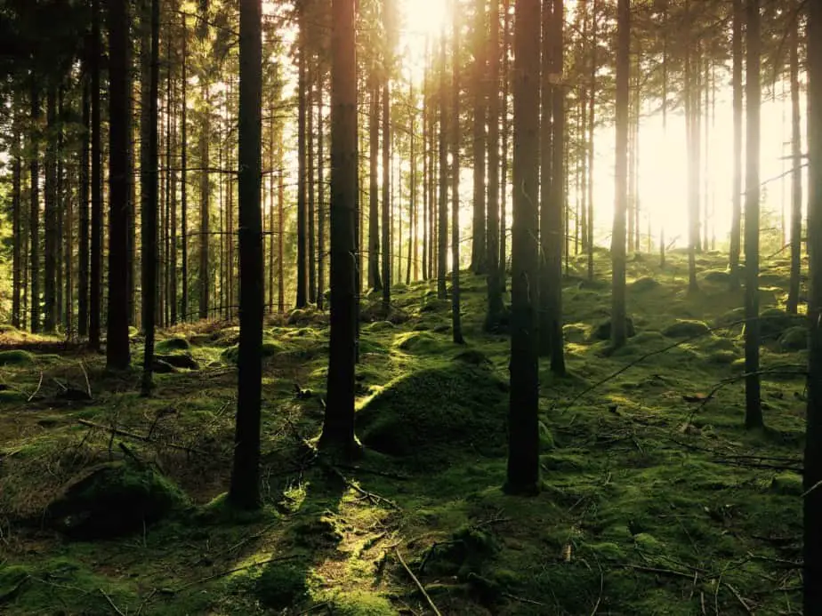
One thing to note is that in many cases, the absence of line – of carving up space in some way – can help ground us the most. Think of standing in a forest, surrounded by trees, with no clear focal point or change in the view around you. This lack of transition from one thing to the next – with no dividing line – can be soothing and healing.
2. Tips On Using Colour In Your Landscape Design
Colour is another core element within landscape design. Again, it falls under ‘form’ – the look and aesthetic of an object, space or overall design.
If you’re new to designing, it can be helpful to determine a smaller colour palette you want to work with in the beginning. Take the different ideas and inspiration you like and try to create a list of approximate colours you want to work.
Many beginners don’t realise having more constraints – more things limiting you – is actually helpful. If you have a specific set of colours you want to include across your design, you reduce the number of options available to you – across plants, materials and combinations. This restriction allows you to play with other parts of your design – your layout, dimensions, spaces and more.
Back to colour – there is quite a background relating to colour theory in many design disciplines. This article goes into good detail about how different combinations work together.
A basic summary to keep in mind is cool colours recede in the landscape. This is the opposite to indoors, where a white wall is the common background. In the garden (indeed, in nature) black and darker colours are what fall back, away from your eye. This can make a space feel larger.
This means warm colours come towards you, making spaces feel smaller – perfect if you want a more intimate, cosy space. Warm colours also work well as feature or focal points – popping from a cooler background.
One last thing to think about when it comes to colour, is to consider, as always, how you will use the different spaces in your garden.
What time of day, season and year will you want to ‘view’ or use an area? Sunlight can change how we perceive colour – Summer makes colours more intense, while Winter subdues things more.
A good idea as you design and flesh out your layout is to create a colour plan that you overlay on top. Think about when you will be inside looking out, or from one part of the garden looking towards another. What colours do you want to see, and when will you be viewing them?
You don’t need to stick to a specific set of colours either. Consider using tonal variants of the main ones – shades of them, pastels etc. – to build a more layered colour palette.
If you’d like to learn more about landscape design in general, check out my 6 Step Beginner’s Guide. If you’d like something more in-depth – try my ebooks the Landscape Design 101 Guide or The Garden Design Process.
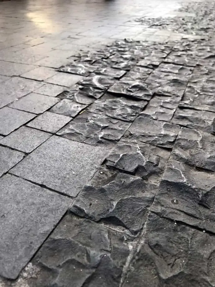
3. Designing Your Garden With Texture In Mind
Texture is how a surface feels. It applies to plants, materials and the overall ‘effect‘ of a particular view – whether it appears hard or soft from a distance. This ‘effect’ is usually drawn from the underlying materials themselves.
The easiest way to understand the intricacies and varieties of textures can be seen within a single tree. The bark, flowers, leaves and branches themselves often feel different to the touch, and they have a dramatic impact on the textural effect of a space when viewed from afar.
Texture is something many beginners ignore, or only consider at a micro level – for a specific plant or material type. Professional designers recognise particular use and emphasis of texture across a site can dramatically enhance the users experience in a space.
Plants and materials with fine textures tend to recede into the background, lengthening a space and making it harder to perceive specific components at first glance. This can help bring other similar components within a space together – forming a nice consistent background.
The opposite of this happens when you choose plants or materials with coarse textures. They advance in the space, drawing your eye. Light often ‘catches’ on the rough, spiky or scratched façade, creating an interesting interplay between areas of light and shadow.
A roughly textured material or plant can make a space feel smaller if they are spread across a space – like the inside of a log cabin. They can stand out as a feature item or focal point if isolated – especially against a finely textured background.
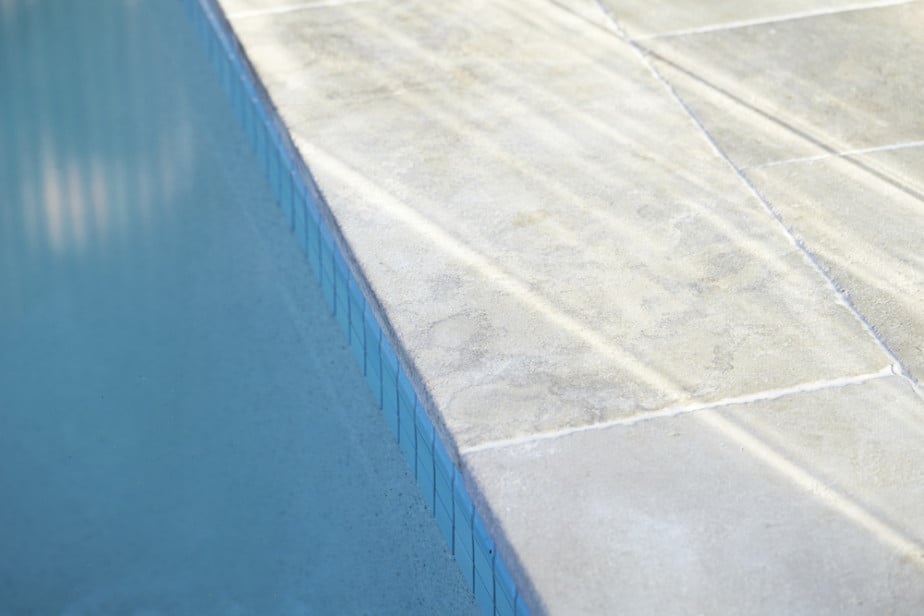
Finally, texture also serves a functional purpose. Placing roughly textured materials in areas people may slip – such as around pools or on steps – adds a level of safety. Alternatively, placing sharp or rough textures in areas around pets or children might not be a great idea.
Thinking about the texture of your material and plant choices in this way helps you determine what finish choices you should make in certain circumstances – to add or remove coarse or fine textures.
Similar to colour, once you have a layout of spaces you are happy with, it can be useful to create a sort of ‘texture’ map. Think about whether you want a space to appear larger or smaller, or have certain features in place.
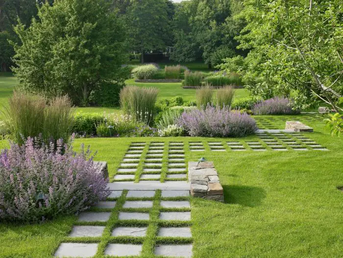
4. The Three Aspects Of Proportion In Garden Design
Proportion is another element, like line, colour and texture, that falls under ‘form‘ in landscape design theory. It’s concerned with the physical properties of an object or overall space.
It covers a few aspects of landscape design – a components proportional dimensions (it’s height, length and width), a components size relative to things around it in the garden, and a component’s size compared to the users – if it’s “human scaled”.
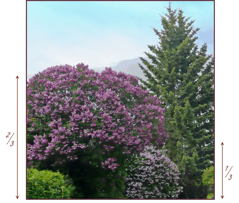
A common way to make something feel like it’s the right size is to follow the rule of ‘thirds’. Take your longest dimension for a component, and make the others 1/3 or 2/3 that measurement. It won’t always work, but is a good way to start planning dimensions for paths, lawns, garden beds and other outdoor spaces.
This also works well for the height of components – even trees, although that is more about the potential range of the mature height of a tree, rather than an exact height.
Once you’ve adequately proportioned an individual component, it’s helpful to compare it to the rest of the components around it in a space. You can change the feel of a space not just by adjusting it’s dimensions, but by playing with the items within the space – and their relative proportions to each other.
Good landscape designers use proportion between components in their designs to emphasise something they want to highlight or to minimise something they want to hide. Small plants beneath a feature plant, or larger plants around a utility box are good examples of this use of relative proportion.
A good example we’ve all seen is how the moon looks larger closer to the horizon than in the sky. Despite not changing size during it’s journey through the night, it looks visibly larger the closer it is to the horizon.

That said, the very best garden designers recognise, like many landscape principles outlined here, that sometimes the best results come from breaking the rules.
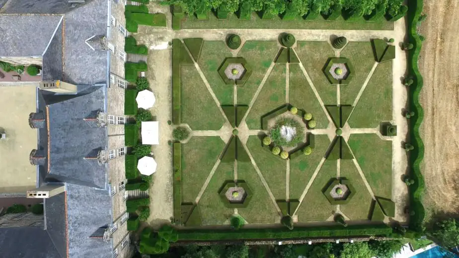
Such as taking advantage of a beautiful oversized tree by purposefully reducing the size of things around it, or allow it to otherwise ‘dominate‘ the space – like the Oak tree in Christine Ten Eyck’s garden further down the page. This way, you are working with your surroundings rather than attempting to tame them.
The final thing to think about when it comes to proportion in landscape design is to have everything you can scaled to “human size”. This means as you sketch out ideas, layouts and designs, draw things to scale (no pun intended) and determine what that would be like in real life – at 1:1.
Make sure the paths, walls, steps, decks, fences, plants, rocks and all the various materials and surfaces you design match how you want to use and enjoy them. Don’t have steps or benches too high to use properly. Don’t make your paths too narrow so they’re basically unusable.
The best way to test this is to measure out your design in your house or garden and see if it works. Another way is to, from the start, stick to ‘standard‘ measurements of heights, widths and lengths. Measure existing things around you and use those to start your designs.
As I mentioned above, proportion is more about how large or small something is relative to it’s surroundings. How large will your mature trees or plants be compared to things around them – including your house? You may find as you design that your path works well at a width of 1.5 m (~5 ft) but then see it is far too wide for the surrounding design.
So when you work through your design, follow the rule of thirds to help determine the dimensions of components. Pay attention to proportion between components to emphasise or minimise them. And always think about making things “human scaled” so they allow you to do what you want to do.
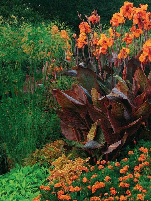
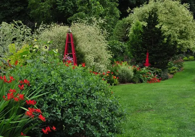
5. Create Interest In Your Garden By Using Contrast
Unlike the elements outlined above, contrast is not really something on it’s own. It takes two competing versions of an element – straight vs curved lines, dark vs light colours, bold vs soft shapes – and through this opposition adds to a style or overall effect within a space.
This competition of elements doesn’t need to occur within the same space or material – it can happen in different ways across your design.
For beginners, it’s best to start with obvious contrasts. So have a garden bed with softer plantings like grasses or ferns, and add a ‘sharp’ or bold component within or next to it. It could be another plant with a strong visual outline, or a sculpture or even a deciduous feature.
You could make the tree extra-interesting if it has small, soft leaves instead of the bold shapes above. This means it can ‘blend’ into the garden bed during spring and summer, and after the leaves fall in autumn, the branches become a strong, shapely element – contrasting the plants in the garden bed.
This change in role from one season to another is what separates landscape design from other design disciplines.
As you explore ideas in your design, look for opportunities to add contrast within a space. If you have too much of something – similar shapes, finishes, colours etc. – it can create a monotonous feeling. Unless this is explicitly what you want, try to add a material, colour or shape that provides some contrast.
Another, more subtle way to introduce contrast is to take existing materials or plants within the design and change one aspect of it. For example, you might want a paving area that has a particular colour and finish of stone. What happens if you change the finish of some them? Make a row, or a random assortment, smoother or rougher in finish?
You can try a similar thing with bricks. Many houses have sporadic bricks of a different colour – why not add that into a paved brick area? Again, for plants, maybe you have a border or garden bed of purple lavender, and every so often you add a white variety?
One of the best ways to introduce contrast into a material or particular area is to ‘borrow‘ an element from another space. Match your rough paving finish to a similar timber or stone finish elsewhere. Or the white lavender links back to the white plants or colours in another area.
This simple approach helps narrow your contrasting choices, and has the added benefit of tying different spaces across your yard together.
6. Solid & Void In The Garden – What It Is & How To Use It
Solid refers to how much something physically or visually occupies space, and Void is all the empty space around it. It sounds like a rather basic thing to consider a principle, but it is a common concept across many design disciplines.
Other terms that fall within this concept are ‘Positive vs Negative‘ space, or perhaps referring to the ‘Weight‘ of an object within a space. In simple terms, it’s reflecting how one component, or part of a design, impacts your perception of that area.
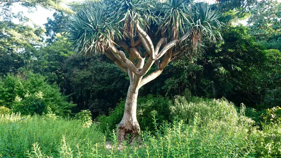
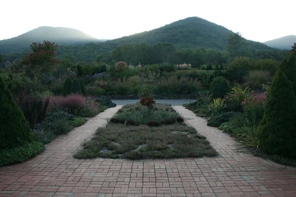
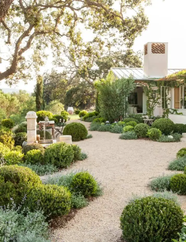
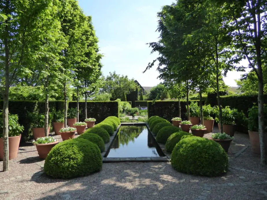
The simplest example is to look at a large tree in a garden. The size of the tree has a big impact on the ‘weight’ of the space, and it’s shape even more so.
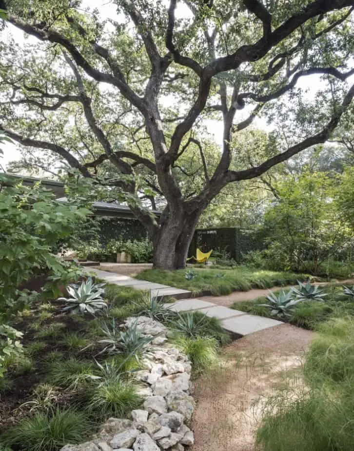
The example above shows the ‘Solid’ imposing Oak tree in the middle of the space. To balance this solid with Void, the designer cleverly kept many of the garden beds and spaces around it at ground level.
Solid vs Void manifests itself differently in different industries. In graphic or web design, it’s about the importance of white or negative space compared to the content – text or imagery.
In architecture it is literally how a room is shaped. We occupy the void, while the walls, floor and ceiling are the solid. The important thing in architectural theory is that the solid doesn’t have to be literal – it can be ‘implied’. The way a cantilevered roof implicitly suggests walls around it is a good example.
As a landscape design principle, it follows a similar pattern. Solid refers to the physical within an area, while space is the… space.
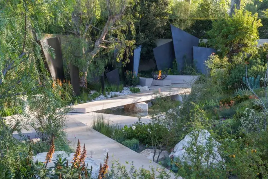
This principle works across all scales within a garden design. Below, the brick path is the void compared the fill of the surrounding garden beds.
As we saw above, a larger tree surrounded by a low garden imitates the solid vs void scenario. So how do you go about designing with this notion of solid and void in mind?
The best way is to draw scaled plans, sections and perspective drawings (easier to do if you trace over a photo of the space). Then explore how changing one component (a tree, wall, patio etc.) within the design impacts how you would view or move through the space.
Start with a base you want to draw over – like your original design sketch – or section or even a photo of the space. Add another layer of trace (or non-waxed baking paper) over the top. Then, redraw this particular component, making it larger, changing the shape or layout or even it’s position within the space.
If you don’t want to sketch out the actual object, simply ‘block’ it – using a black rectangle or other shape to “suggest” or intimate the item. It won’t necessarily be pretty but it can be effective.

Do this as many times as you like, seeing what it will look like in plan, side on or in perspective. Don’t forget to research and draw the mature size of plants and trees so you are properly representing how the space will look when they grow to full size.
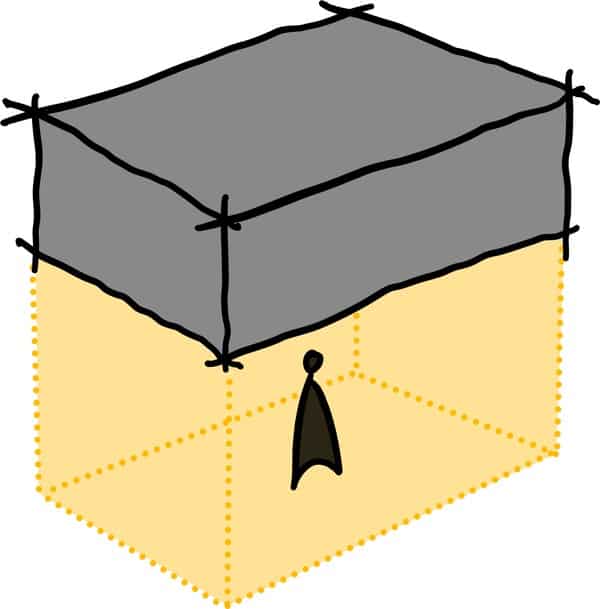
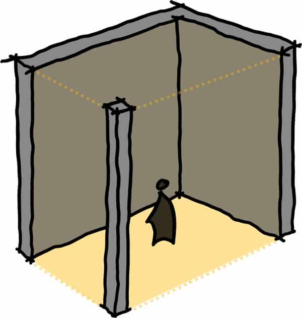
Stepping back from the how for second, we can consider broader design approaches that deal with solid and void. A great example is the idea of “open enclosed spaces”.
That sounds like an oxymoron, but in reality refers to spaces like patios and terraces that are sheltered overhead, but not walled in on all sides. The solid weight above provides a sense of comfort and protection, while the expansive view out still allows you to view what’s happening around you.
One final thing to note is although we’ve discussed physical objects and space comprising solid and void, you can also consider the effect of shadow and light. Shade is dark, and recedes in the landscape, changing it’s character. Light is bright and advances, highlighting points, and helps carve up space in otherwise empty areas.
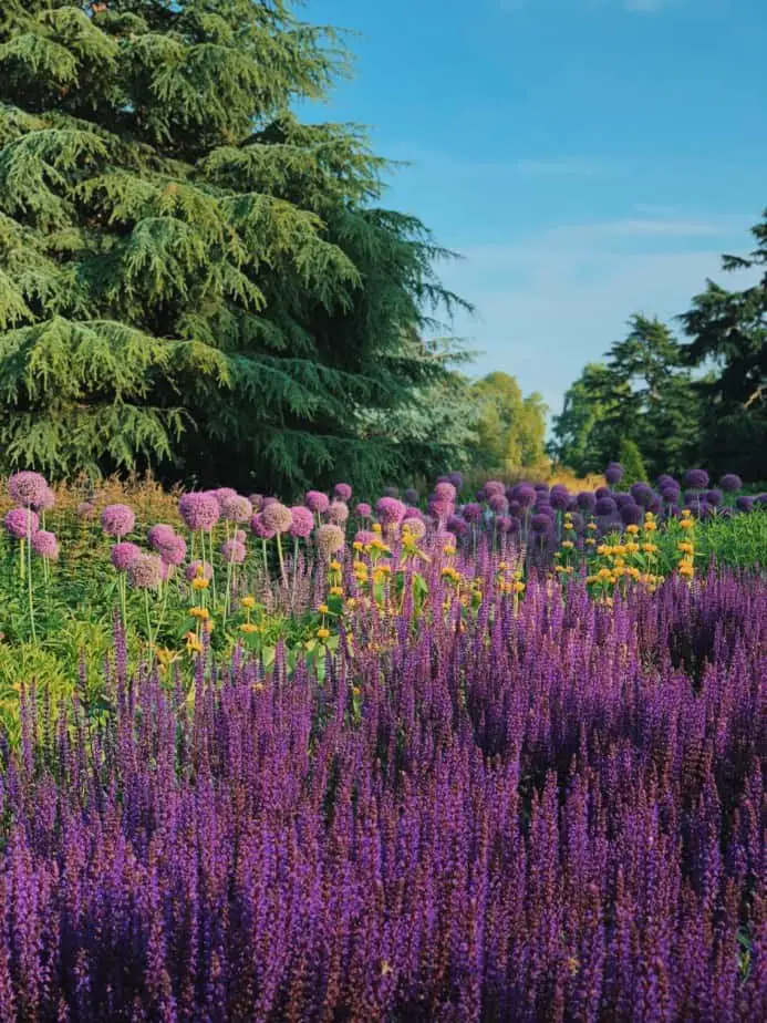
7. Repetition & Rhythm Creating Dynamic Garden Designs
Repetition is what it sounds like – repeating something within a design. It could be colours, materials, a particular motif, a layout or a specific component like plants or steps. Seeing the same things repeated unconsciously builds familiarity with the space, calming visitors and users of the space.
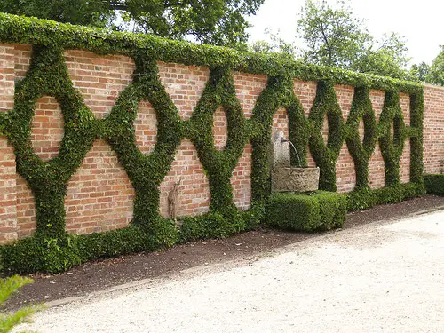
You don’t need to be overt with repetition either – have everything exactly the same across a design. Sometimes repetition is more about an ‘echo‘ to another area. As we’ve discussed, it could be repeating a material, colour or finish in multiple places.
One way to try to design with this is to take something in your design, scale it up or down, and place these versions elsewhere in your garden. A feature tree in one spot can have little ‘echo’ shrubs or grasses in other spots that ‘call’ back to it.
Despite the importance of repetition, too much can make a design drab and stale. A hospital or school corridor can certainly be repetitive, and they’re generally not places people enjoy walking through time after time.
So if your design, unless it happens to be extremely formal or modern, starts to feel the same, it’s worth adding some randomness into it in some way to liven things up. And a good way to inject some is to have less repetition and focus more on ‘rhythm’.
Rhythm refers to the pacing of a design. So when you are moving through a space, how does it feel? Do things come across your vision haphazardly, or is there a flow? Do you get a sense of familiarity from the materials, colours and other components? Or is there something new at each turn?
This applies more to larger gardens, but you can imitate these sensations even in smaller ones. As you design, determine the main ‘viewpoints‘ in your design.
What direction will the user be looking out towards? What components will you place there, and do they seem related? Or from different gardens?
Once you have these planned out, experiment with direct and indirect ways to access these spaces, and see how you can add rhythm or repetition to enhance that journey.
8. Reduce Options & Bring Unity To Your Garden
Like contrast, unity is more about a collection of principles or elements and not something you can ‘apply’ on it’s own. It is, however a kind of marker – something you should aim for – and always consider as you are designing any outdoor area.
In many ways Unity is all about limiting how many of each element you opt for in your design. Like I said earlier, limiting your options to a few key colours, or textures or line styles can really help you as you design.
I’ve mentioned it before, but a great way to simplify things is to start designing with a specific garden style in mind. Look at images of styles you like and see what colours, plants and materials they are using. Take that inspiration, scatter it across the different areas in your garden, and you’ll find it hard not to have unity in your design.
Bringing a garden together tends to be one of those things you only think about when you find examples of where it doesn’t happen. You’ll notice is that plants, components and ornaments scattered around randomly doesn’t really work.
This is a common mistake people make in their actual gardens because they are focused on one specific item, area or project. This leads to a lot of siloed, isolated things that don’t relate to anything else around them.
Another way to try and introduce unity into your design is to sketch things out multiple times and move things around – objects, materials and colour – to see how things change.
The best way to remedy this is to remove things one at a time. See what really adds to the space vs what detracts from it. The saying “less is more” is often true.
When it comes to positioning the solid, physical components in any space, a good rule of thumb is to place them in odd numbers. This works especially well with plantings. Place them in threes, fives etc. – even if they are different species and sizes. It looks more natural to our eye to have things kind of ‘clumped’ together in odd sets, not even.
Start with your main ‘feature’ element – like a large tree – and work out from that position. Because it is the focal point, you want it to contrast a little with its surroundings. Use whatever makes it ‘pop’ – shape, colour, size etc. – as little as possible in the background around it.
Finally, as with any principle, you can, if you are daring, try to reject it. One way to reject the kind of manicured unity we have been talking about is to do the opposite – make things less obvious, repetitive or consistent.
A good example is keeping some areas purposefully wild, without clear lines of sight or a focal point. These spaces work better if you’re ‘unsure’ within them – not from outside looking at them.
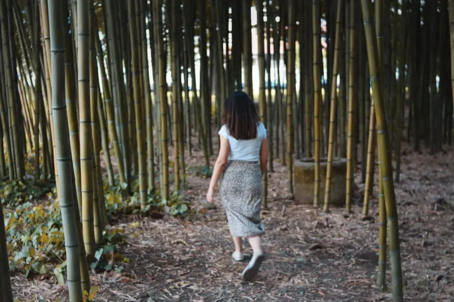
A small bamboo forest is an excellent example, where the lack of focal point fosters a sense of enclosure and protection.
9. Harnessing Hierarchy When Designing Your Garden
A very visual principle. Essentially, what you see first, what catches your eye. After the first impression, what does your eye flow to next? And the next thing? Finally, what is the background behind all of this?
Most people know of this as the ‘focal point’. In many cases it’s a specific component, placed with intent, to capture attention and stand out. Hierarchy as a principle goes a step further, where you consider not just the main focal point, but the components around it that contribute to the whole effect.
Each of the elements that underpin ‘form’ in landscape design theory contribute to this sense of hierarchy. You can use any one of line, colour, texture or proportion to bring one component in a space forward, or push others to the background. And contrast can exacerbate this layering even further, again, applying it to any of those elements.
Hierarchy also happens at multiple scales.
It can be within a specific garden bed – the layout and selection of plants, where one ‘pops’ from the others.
It can be within an area or ‘room’ in a design – with a specific feature standing out due to height, material, shape or other factors.
Finally you can make a specific component or space within your whole garden design the main focal point. The thing from which all other aspects of the design either link to, or contrast with.
The best designers are able to ‘invert‘ hierarchy – specifically a focal point. Perhaps the feature you want to ‘highlight’ as a focal point is not anything within your design at all.
It could be the space frames a particular external view. Or encourages you to listen to your surroundings. Or is simply a place to enjoy the sun, the breeze, or even the shade. Designs like this recognise that landscape designs can be more than pretty visuals.
10. The Elegance of Symmetry & Energy of Asymmetry In Garden Design
Symmetry, like line, can quickly tell you what style of garden you are looking at. Formal gardens lean into symmetrical layouts, while informal gardens opt for asymmetry – spreading ‘weight’ of spaces around more naturally.
Symmetry is easier to develop at first glance, but requires a keen eye for detail and exacting standards. Something slightly offline or out of place is instantly noticeable. Like modernist design, simplifying things tends to lead to less places to ‘hide’ mistakes.
Asymmetry is appealing if you can do it right. As we talked about weight above, you need to understand how heavy the components in your space feel.
The best way to create an asymmetrical design is to test your design and layout of components. The simplest way is through drawing sketches, sections/elevations or even making simple ‘working models’.
As you explore positioning things, you need to know the approximate mature sizes of the plants and trees you are placing. You want to understand the space when it is ‘complete‘ – not when it’s first planted.
Once you have an idea of those heights and shapes, you can quickly sketch out a view, changing how things are positioned to see what you feel works best.
This approach works well if you have a particular position in your design you want to view this space from – it could even be in the house! Lastly, ensure any sketch or section you draw has an outline off a human figure in them – so you can understand how large or small different spaces are.
And this covers the 10 Most Important Principles in Landscape Design Principles you can refer to as you develop your own garden designs. Let me know what you chose to work with in your landscape design process down below!